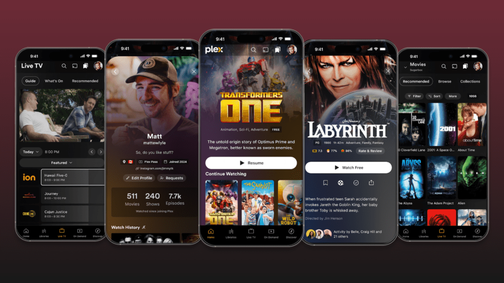
Plex is redefining its user experience with a bold redesign of its mobile app interface, a project two years in the making. The overhaul, now available in preview mode, represents a strategic leap forward for the company as it positions itself as the ultimate interface for personal media, streaming services, and social connectivity. With a full release planned for early 2025, the update includes a unified codebase, revamped UX architecture, and a renewed focus on user discovery and engagement.
In an exclusive interview, Plex Co-Founder and Chief Product Officer Scott Olechowski and VP of Product Design Jason Williams shed light on the vision behind this transformation. They discussed how the redesign supports Plex’s 17-year journey, the challenges of scaling innovation, and the broader business outcomes the company aims to achieve.
A UX Overhaul Years in the Making

The new Plex app introduces sweeping changes designed to improve usability and align with Plex’s mission to connect users with the entertainment they love.
- Streamlined Navigation: The app’s navigation structure has been reorganized to prioritize ease of use, with intuitive one-thumb access to features like personal media libraries, Watchlist, live TV, and FAST channels.
- Enhanced Visual Aesthetics: Expanded artwork across titles, cast and crew profiles, and user pages enhances the app’s immersive quality.
- Centralized Codebase: Moving to a unified codebase with React Native allows Plex to iterate faster and maintain consistent quality across platforms.
“The previous interface had become cluttered as we layered on features over time,” Williams explained. “This redesign is a fresh start, letting us align the UX with Plex’s core mission while paving the way for future innovation.”
The update also responds to user feedback gathered over years of forum discussions, support interactions, and direct user panels. Plex’s fanatical community—what I referred to during the interview as “die-hard day-oners”—played a key role in shaping the redesign. Olechowski emphasized how vital this user base is to Plex’s evolution, noting, “If they’re not giving feedback, they don’t love you.”
Driving Business Outcomes Through Design
The redesign is not just about aesthetics; it’s aimed squarely at increasing engagement and retention. Plex’s three strategic pillars—content, discovery, and community—inform every aspect of the overhaul.
“We’ve always focused on helping users maximize their leisure time,” Olechowski said. “That means connecting them with the content they love and making discovery seamless.”
Key to this effort is Plex’s Watchlist, which has become a core feature since its introduction. With 26 million users adding over 150 million items, the feature has proven critical to Plex’s strategy of being a central hub for content discovery. By giving Watchlist a dedicated place in the navigation, Plex is doubling down on its role as the “front page” of streaming.
The app redesign also reflects Plex’s unique position as an independent platform in a crowded streaming landscape. Plex aims to offer a differentiated experience that competitors cannot match by focusing on features like social connectivity and universal discovery.
Exclusive Interview: Insights from Scott Olechowski and Jason Williams
For a deeper dive into the thought process behind Plex’s UX overhaul, watch our full interview with Plex Co-Founder and Chief Product Officer Scott Olechowski and VP of Product Design Jason Williams. They discuss the challenges of redesigning a multi-faceted platform, the role of community feedback, and the long-term business strategy behind the update.
Why React Native Matters
One of the most significant changes behind the scenes is Plex’s adoption of React Native for its codebase. This shift consolidates seven codebases into just two, enabling the team to deploy features faster and more efficiently.
“Sometimes projects like this come with trade-offs,” Olechowski said. “But this time, we’re improving performance, quality, and user experience without compromise.”
The new codebase also allows for greater collaboration across Plex’s team, helping ensure the updates are consistently high-quality and timely.
Scaling for the Future
While the current focus is on mobile, Plex’s vision extends well beyond smartphones. Olechowski confirmed that a similar redesign for TV platforms is in development, with a preview expected later this year.
“When you sit down on the couch, Plex should already have prepared what you want to watch,” Williams explained. “Mobile is a critical part of that journey—managing your Watchlist, connecting with friends, and discovering content all happen there.”
Plex aims to establish habits that translate seamlessly to the big screen by prioritizing mobile-first development.
Looking Forward
Plex’s UX overhaul is more than just a redesign—it’s a redefinition of what a streaming platform can be. By combining sleek design with robust discovery tools and social connectivity, Plex is positioning itself as the ultimate hub for personal media, streaming content, and community interaction.
With these updates on the horizon and user feedback shaping the experience, Plex is doubling down on its mission to connect users with the entertainment they love, no matter where it lives.


