
Netflix has finally done what the rest of the industry has been pretending to do for years: rethink the actual experience of watching TV. The new interface, dubbed Eclipse, isn’t just a visual refresh—it’s a declaration that Netflix’s ambitions have outgrown the endless scroll.
Gone is the outdated carousel of tiles that’s been endlessly duplicated by nearly every competitor since 2013. In its place? A homepage that actually responds to what you want, when you want it. Hover over a show, and you get expanded artwork, a quick synopsis, some awards badges, and maybe even a preview—all without committing to a click. It’s not just about aesthetics; it’s about frictionless engagement.
And that engagement is getting smarter. Search for horror, and horror starts populating your screen while you’re still looking. Netflix has quietly turned the homepage into a heat-seeking missile for your mood. The company wants its recommendations to feel instinctive—like the service just gets you. And increasingly, it does.
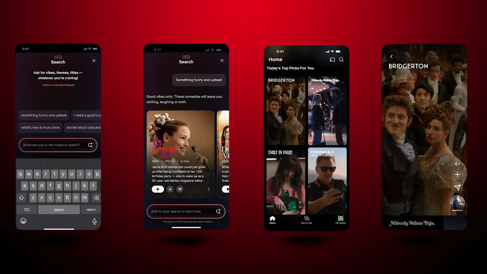
But the TV experience is only part of the equation. On mobile, Netflix is testing a vertical video feed—a shameless but smart lift from TikTok. Clips from shows and movies will autoplay in a scrollable stream, giving users the option to watch, save, or share. The feature turns Netflix into its own discovery engine instead of relying on trailers, autoplay rows, or your cousin’s group chat.
Even search is getting an AI upgrade. A small iOS beta is rolling out that lets users type phrases like “something light and funny,” the app will serve up content that fits the vibe. Translation: Netflix is doing what every streaming interface should be doing by now—taking the guesswork out of guessing what you want.
Officially, nothing is changing for ad-tier users. Same experience, different price. But let’s be honest: a more modular, animated, and context-rich interface is a goldmine for future ad integrations. The groundwork is already there. Sponsored titles, branded badges, interactive promos—it’s all possible now, just waiting for the go-ahead. This isn’t speculation; it’s inevitability with a UI.
Also worth noting? The timing. Netflix drops this redesign a week before their upfronts. Sure, execs say the two aren’t connected. And sure, maybe that’s true. But if you were about to pitch advertisers on a shiny new vision of your platform, would you rather show off your old tile graveyard or a sleek new experience that screams, “We know what we’re doing”?
Other platforms should be taking notes—and getting nervous. Because Netflix just redefined what “user experience” means in the streaming era. This isn’t just about design. It’s about control, about data, about creating an interface that can adapt as fast as viewers can change their minds.
No more legacy layouts. No more static rows. Netflix is no longer iterating. It’s iterating on its iterations.


